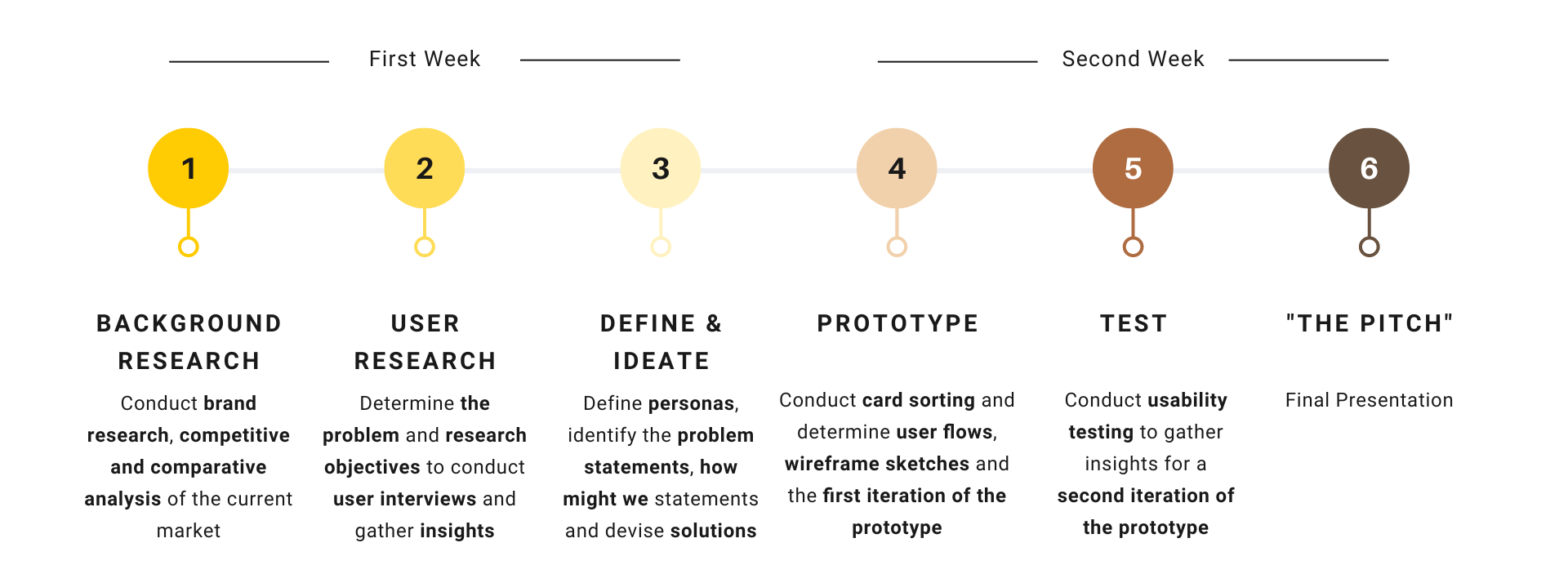
2-week Design Challenge as part of
General Assembly UX Design Immersive
Role
UX Researcher, UI Designer
Tools
Miro, Figma, Google Forms
Being a 1-person design consultancy, the challenge was to re-imagine and re-design the online shopping experience of an assigned brand - L'Occitane. Through market research and understanding consumers' needs, the journey of "how might we re-imagine L'Occitane's online shopping experience" begins.
As I was relatively new in taking up a 2-week design challenge, I first took some time before embarking on the project to set realistic expectations and timelines for myself. This is to ensure that I was able to complete all of the tasks within the stipulated time frame.
L'Occitane en Provence, commonly known as L'Occitane, is a French luxury retailer of beauty and cosmetics products based in Manosque, France.
L'Occitane brands itself as a global, natural and organic ingredient-based cosmetics and well-being product manufacturer and retailer which has strong roots in Provence.
The target market of L'Occitane is mainly high income, cosmetics-driven women who are looking for genuine fragrances and authentic products. Hence, most of the brand's gender demographics are female who are between the age of 25 to 44.
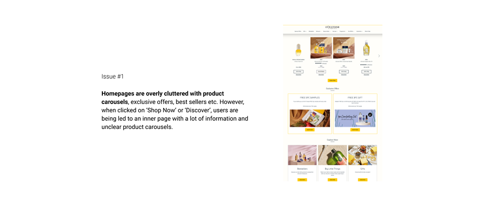
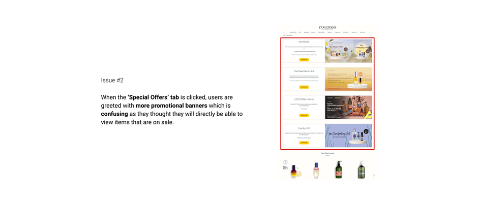
With the increase of tech-savvy consumers, especially the younger generations, having a good online presence is a key to engage customers in an attempt to increase sales. Hence, I have looked at how L'Occitane compares against its direct competitors, while also looking at its indirect competitors to analyse other critical features that make their businesses work.
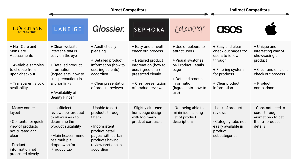
Through the competitive and comparative analysis, I have came up with the following insights:
Product information needs to be presented clearly and as detailed as possible so that users know what they're in for when browsing or purchasing a product
Product reviews are an essential part of the online shopping experience as users tend to rely on them to determine the suitability of the product for themselves
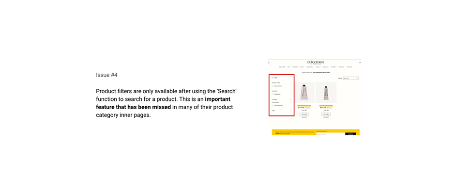
Clear categorisation and availability of filters on the product listing page are crucial in assisting users in finding the product that they are looking for
A clear and efficient check out process is needed such that users do not feel thrown off at the end of their purchase
To gain a clearer understanding of users' experience on an online platform, I first conducted a screener survey via Google Forms to recruit potential participants who have experience in purchasing beauty and cosmetics products. Based on the screener survey responses received, I have interviewed 9 participants who have a mix of preference in shopping for beauty and cosmetics online and offline. The interviews took place either via Zoom and Discord. During the interview, interviewees had a chance to explore the current L'Occitane website and their feedback with regards to checking out with a product, searching for a product, and getting a product detailed information were recorded.
From my user interviews, I have summarised my findings into 2 affinity maps, one for "online" preference, and another for "offline" preference. Based on the 2 affinity maps, there were similarities and I have further streamlined my findings and concluded with my research insights.
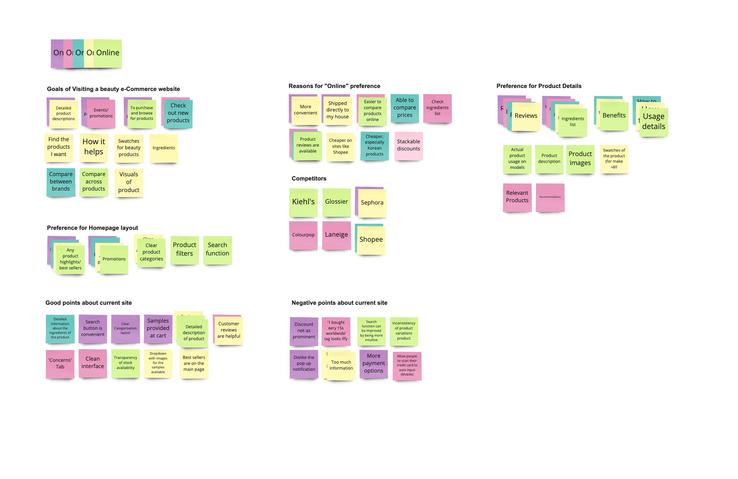
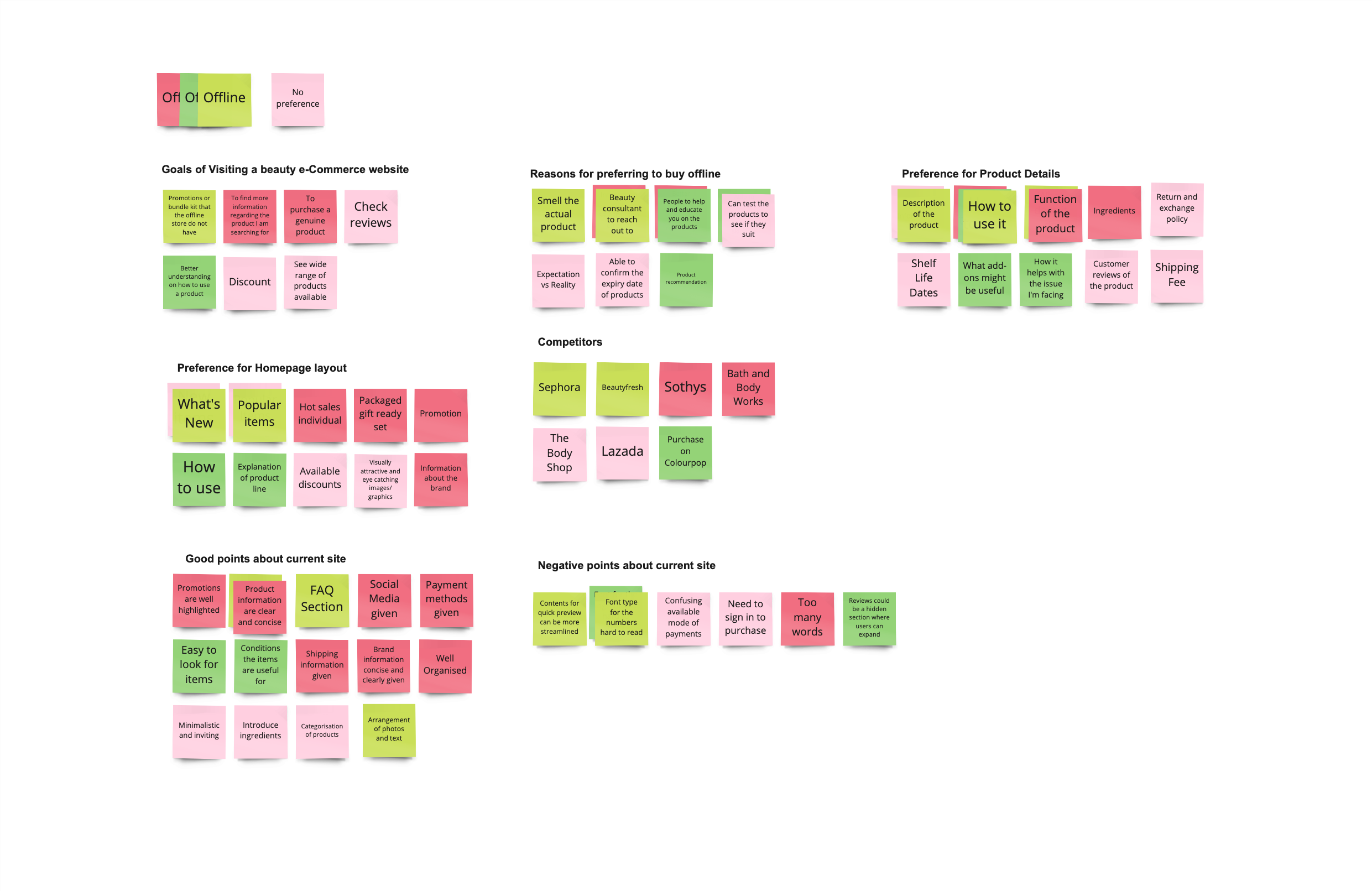
Users would want to be able to read product reviews so that they are able to determine the quality and suitability of the product through the reviews of others
Users prefer product information to be detailed with clear product images, ingredients list, and instructions on how to use the products so that they are able to know the type of product that they would be expecting upon purchase
Best sellers and promotions are a crucial part of an e-commerce site as they attract many potential users
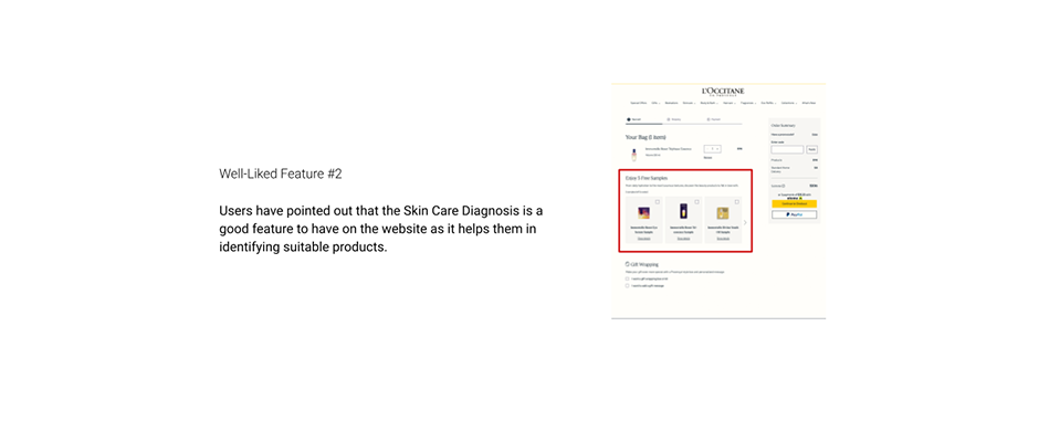
Users find it difficult to determine the suitability of skin care products (especially) if purchases were made online as they are not given samples to test how the products feel and look like on their skin
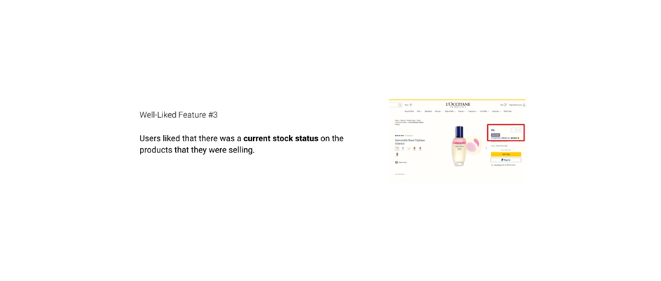
Users prefer payment methods to be stated clearly to avoid confusion or disappointment upon checking out when they realised that the type of payment methods that they would like to use is unavailable
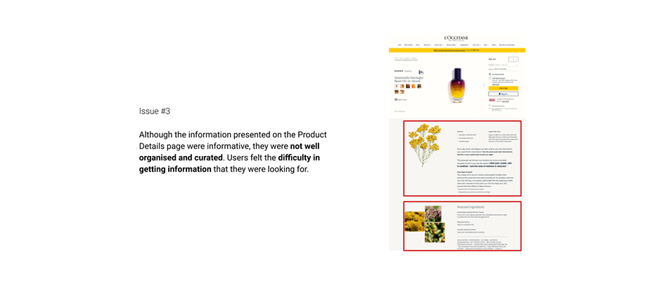
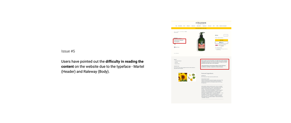
Users would like website content to be curated and streamlined so that they are able to get the essence of the overall content at a glance
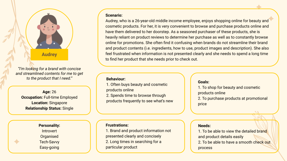
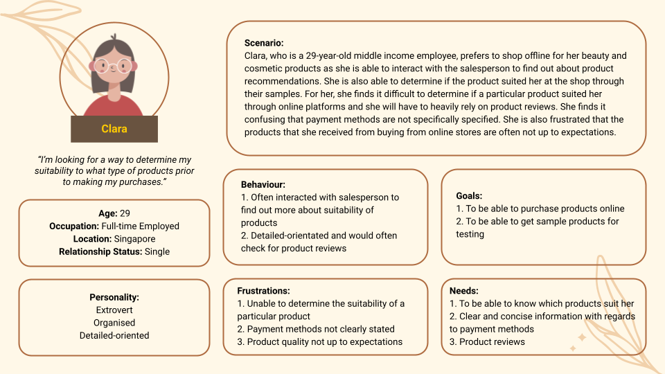
Moving forward, I identified two personas: (1) Audrey, a frequent online shopper seeking for a clear and detailed brand and product information alongside promotions, and (2) Clara, a physical offline shopper seeking to find and buy suitable beauty and cosmetics products online.
From my personas, I created the problem statements to effectively identify the issues of my users.
"Audrey needs an informative, concise and efficient website to reduce the time needed for her to purchase beauty and cosmetics products at the lowest price."
"Clara needs an intuitive and effective method so that she is able to determine the suitability of the beauty and cosmetics products she intends to purchase online."
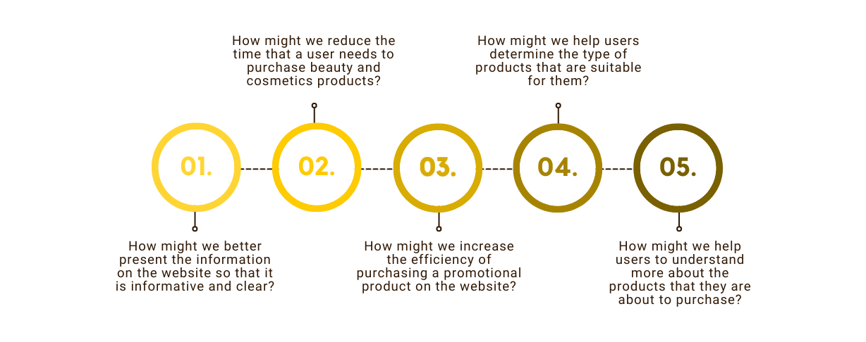
Based on the problem statements, I identified the 'how might we' statements that I should address during the process of re-imagining the shoppers' experience.
From the problem statements and 'how might we' statements, I started to brainstorm on ideas that could address the problems that the users face. I came up with a total of 6 ideas that will be addressed in the revamped prototype.
Product Descriptions (Product Name, Price, Product Explanations, Ingredients, How To Use) alongside Product Reviews should be presented clearly so that users are able to determine if the product suits them and get the relevant product information easily.
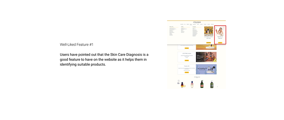
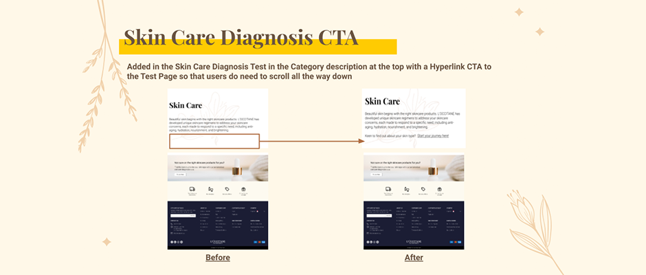
Existing Skin Care Diagnosis Test and Hair Care Assessment Test is not prominent enough to allow users to try them out, hence there should be more CTAs and more areas that feature these tests to increase user-usage.
Rearrange existing contents so that they are more concise and better streamlined for users to get the information they want quickly.
Current site's 'Search Results' page has filters inclusive, and all product listing pages should be standardised across the website with similar filters so that it will be less confusing for users.
Search results can be more intuitive so that when users search for a product directly, they are able to see the most relevant results first.
Guests users should be allowed to check out and a sign in CTA/sign up CTA should be included on the check out page as a note to users.
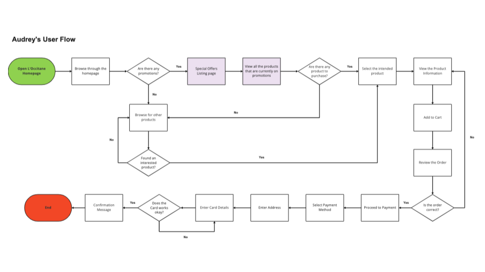
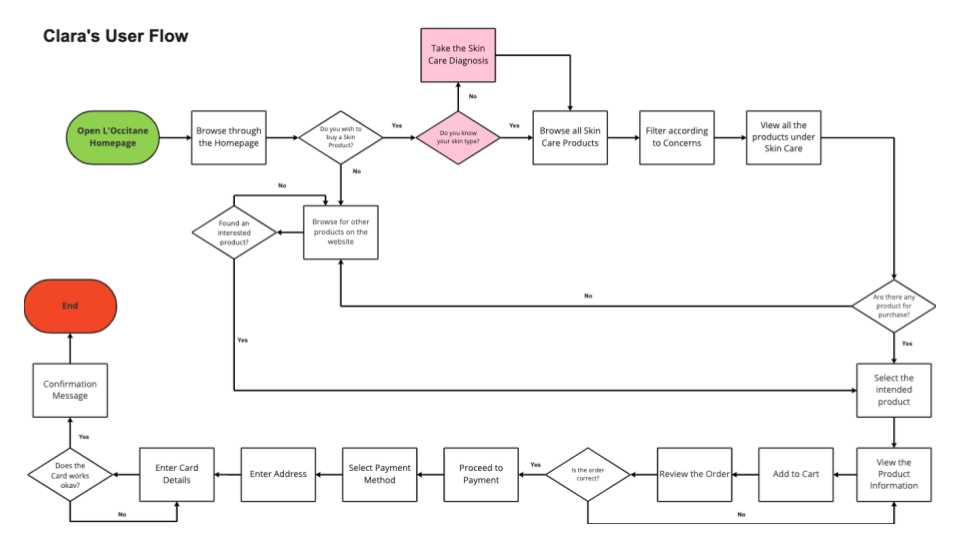
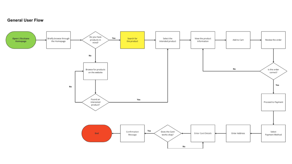
From my interviews, interviewees have mentioned that the current user flow of selecting and purchasing a product is relatively clear and easy to complete. Thus I went ahead with devising 3 user flows - (1) for Audrey, (2) for Clara, and (3) for a General User. For Audrey's User Flow, it focused on finding and purchasing a product that was on special offer. For Clara's User Flow, it focused on finding and purchasing a skincare product that was suitable for herself via the Skin Care Diagnosis Test. For the General User, it was just a simple step of searching for the product directly and purchasing it.
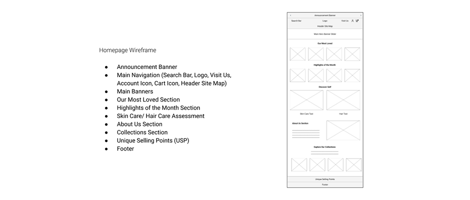
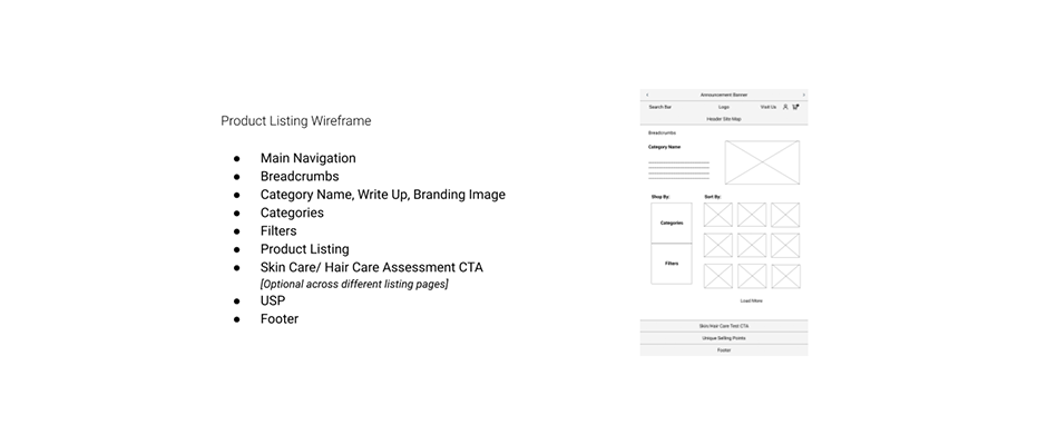
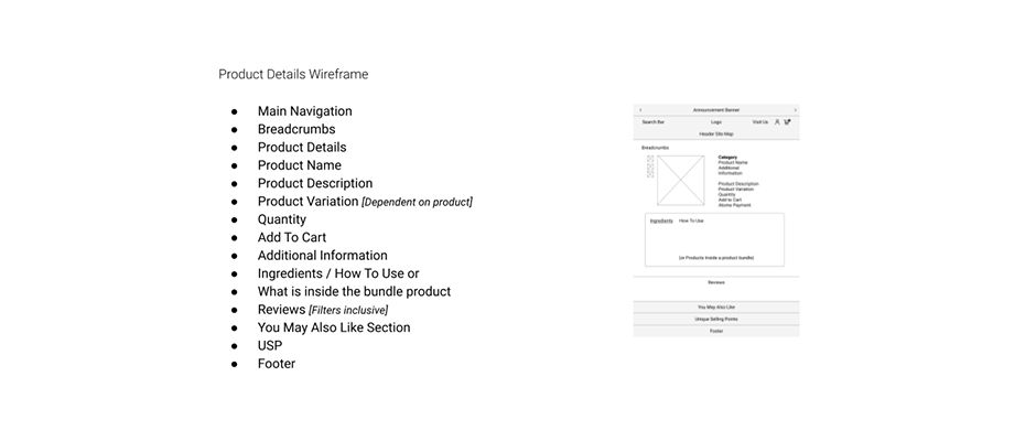
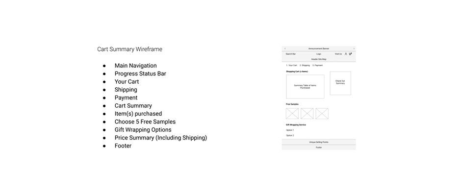
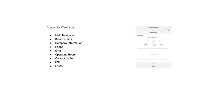
From the user flows, I sketched out my wireframes for the following pages - (1) Homepage, (2) Product Listing, (3) Product Details, (4) Cart Summary, and (5) Contact Us.
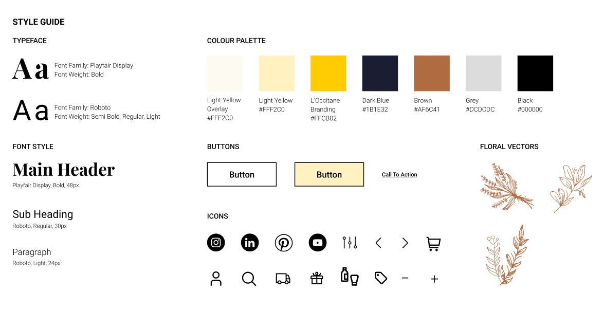
L'Occitane's main branding colours were yellow and dark blue. By taking that into consideration, I have used colour variation of the same hues in the design. In addition, as most of L'Occitane's products centers on beauty and cosmetics, I added in an additional branding colour of brown. Brown is the commonly seen as simple, authentic and natural, which fits into the L'Occitane's overall branding. The reason for including floral vectors as part of the design is because L'Occitane uses ethically sourced ingredients such as Almond, Immortelle, Lavender, Meadow Sweet and Shea Butter, which are grown from plants and trees.
From the first iteration of our prototype, we conducted a usability test with 6 of our previous interviewees to test our the prototype that we have created. It was a remote and unmoderated usability test.
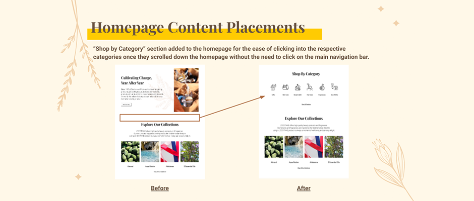
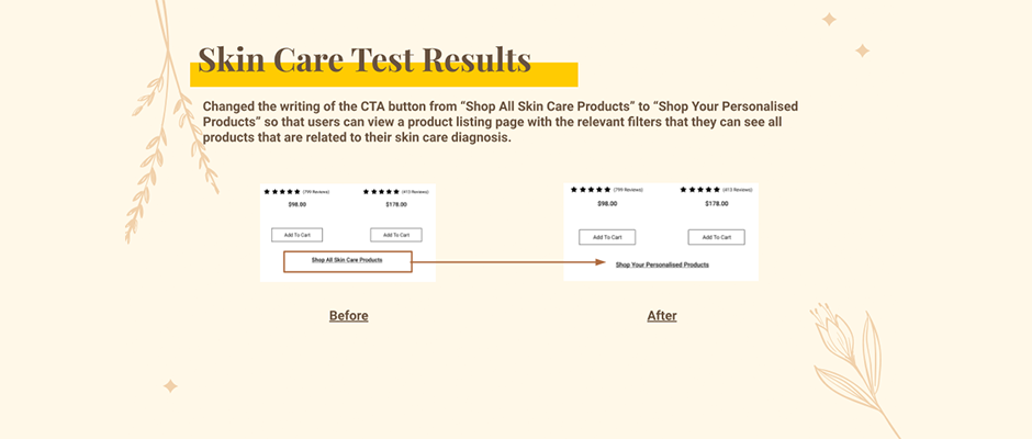
From the usability test, participants are able to use the designated steps to get to the final objective of each scenario. They were able to complete all 3 tasks in 3 to 4 minutes (on average) and they found the user flows easy to navigate. However, participants have also pointed out areas of improvements in 3 areas: (1) Homepage Content Placements, (2) Skin Care Diagnosis CTA Button on the Skin Care Listing Page, (3) UI of the Skin Care Test and (4) CTA Button Writing of the Skin Care Test Results.
Based on the usability test results, I proceeded to make improvements on our existing prototype.
Here's the link to my final prototype. Best viewed on a laptop screen!