3-month internship experience at Cheil RHQ to improve overall user experience for customers on the e-Commerce sites
Role
UI Designer, UX Researcher
Tools
Figma, Jira, Beusable, VWO
At Samsung, new products are frequently launched on the e-Commerce website, making it essential to provide customers with a seamless user experience—from browsing and adding items to the cart to completing the checkout process as quickly and efficiently as possible.
In order to gain a better understanding of the user actions and their current behaviour on the webpage, the UX team works together with the Data Analytics team to get quantitative data. Not only that, the UX team uses the tool such as Beusable to get heat map data, as well as VWO to see screen recordings on how different users interact on the Samsung web pages.
Beusable provides insights into scroll depth, click rates, and the most frequently used buttons by users. This helps us evaluate whether important content should be moved closer to the top of the page to improve visibility without requiring excessive scrolling. It also allows us to analyse button placement based on user click behaviour.
To track user interactions on the website, VWO provides screen recordings of different user sessions so that we are able to review and understand where the users are dropping off on the site. This helps us to understand user behaviour and optimise the site for better engagement and conversions.
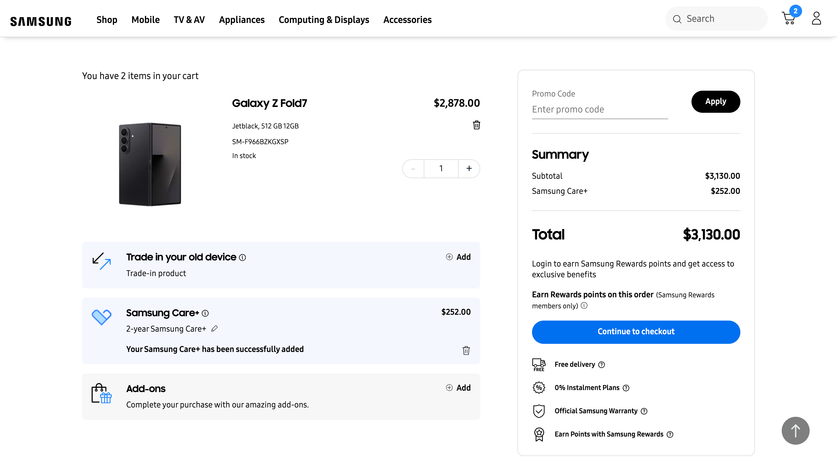
Our goal was to streamline the checkout process by presenting information on the checkout pages in a clear and concise manner, making it easier for users to complete their purchase. This helps ensure a smoother user experience, ultimately increasing the likelihood of conversion.
We proposed reorganising the layout to group the various add-ons that users can add to their cart into separate sections. Additionally, we recommended prioritising key information such as the total cost, checkout button, and promo code field by placing it higher on the page, rather than emphasising secondary benefits.
This approach aims to improve the visibility of cross-sell opportunities. To increase the likelihood of users adding extras like Samsung Care+ or other optional add-ons, clear visual cues are necessary. At the same time, users are typically more interested in understanding the total amount they're spending and seeing a clear cost breakdown, so these elements should be more prominently displayed than supplementary benefits.
We also suggested placing the promo code input field before the summary table, ensuring that any discounts are applied in real time and accurately reflected in the cost summary.
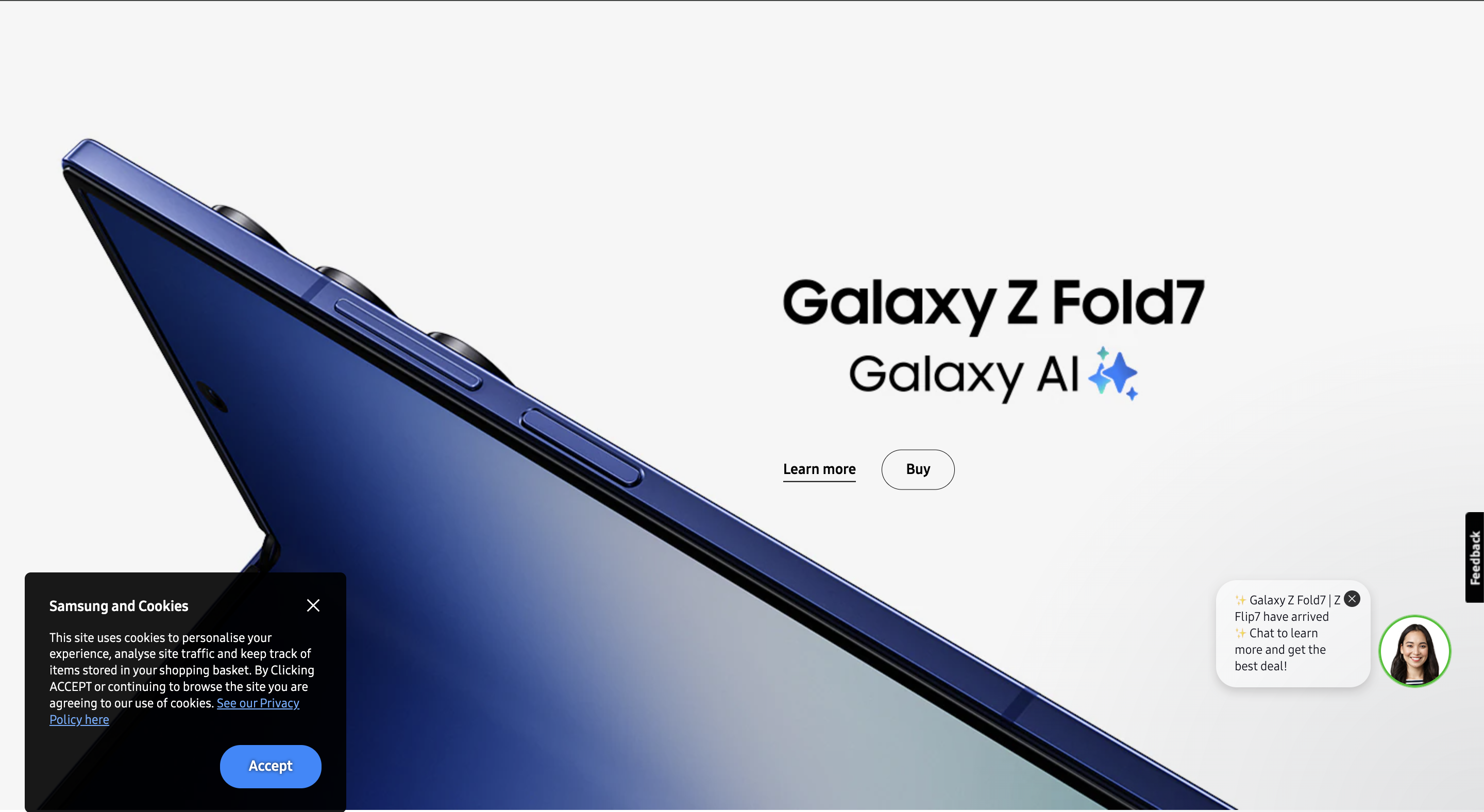
We identified that the previous cookie popup was ineffective due to its placement and colour scheme. Positioned at the bottom of the page, it made it difficult for users to either close it or accept the terms and conditions as it will sometimes be covered by the existing chatbot.
Hence, we proposed a redesigned popup that appears in the bottom-left corner, ensuring it doesn't obstruct the chatbot interface. Additionally, we repositioned the 'Accept' button to the bottom right of the popup, aligning with common user expectations where primary actions are typically placed on the right.